Formica Creative Group
Formica Creative Group is an event agency specializing in wedding organization in Kyiv and the surrounding region.
Formica Creative Group is an event agency specializing in wedding organization in Kyiv and the surrounding region.
Objective
The objective is to create a brand style for the event agency, which is not possible without a unique logo. This is particularly important considering the specific nature of the company's activities. Aesthetics play a crucial role, along with dynamism and lightness.
The objective is to create a brand style for the event agency, which is not possible without a unique logo. This is particularly important considering the specific nature of the company's activities. Aesthetics play a crucial role, along with dynamism and lightness.
Solution
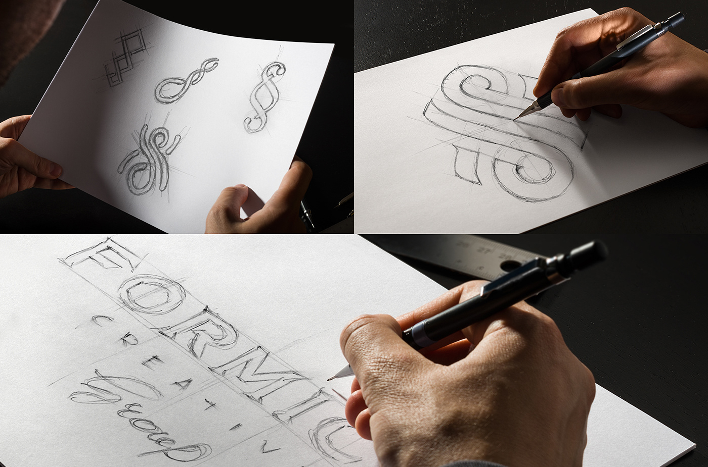
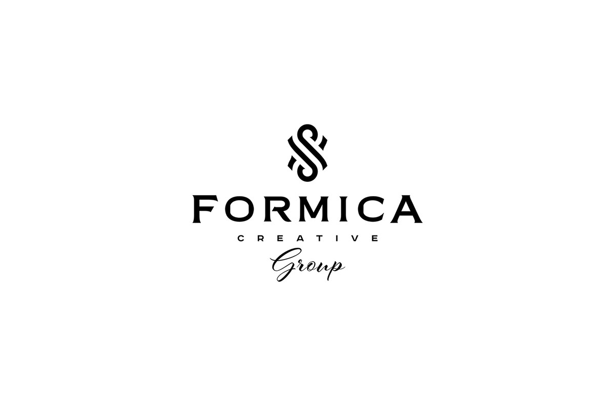
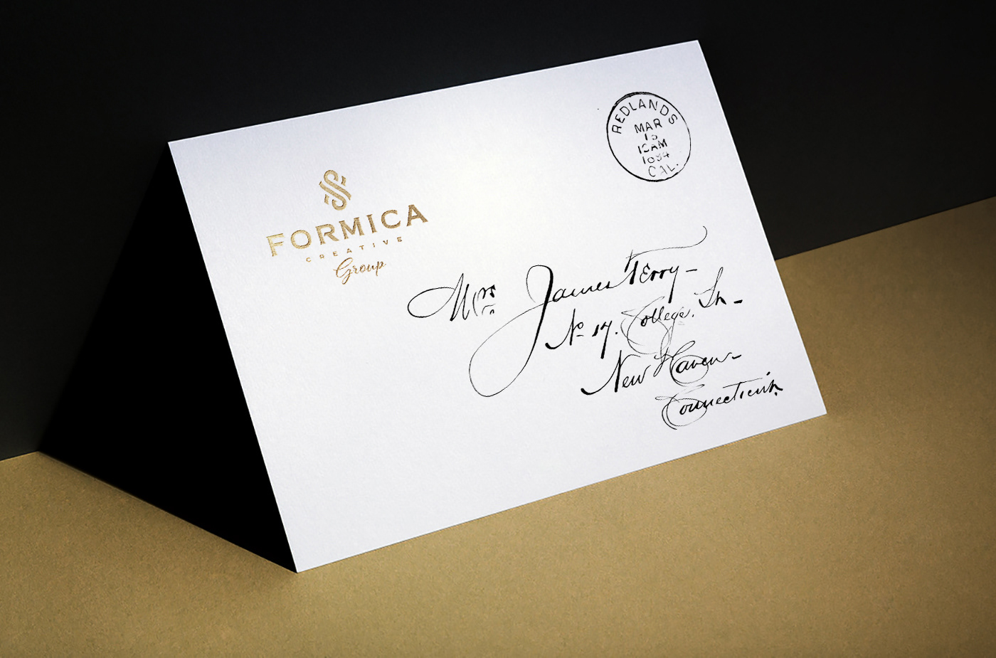
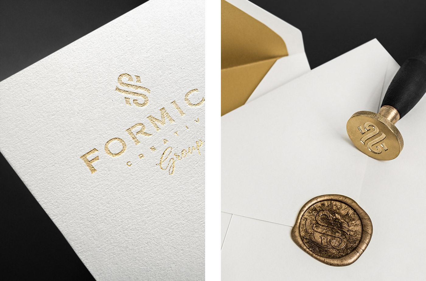
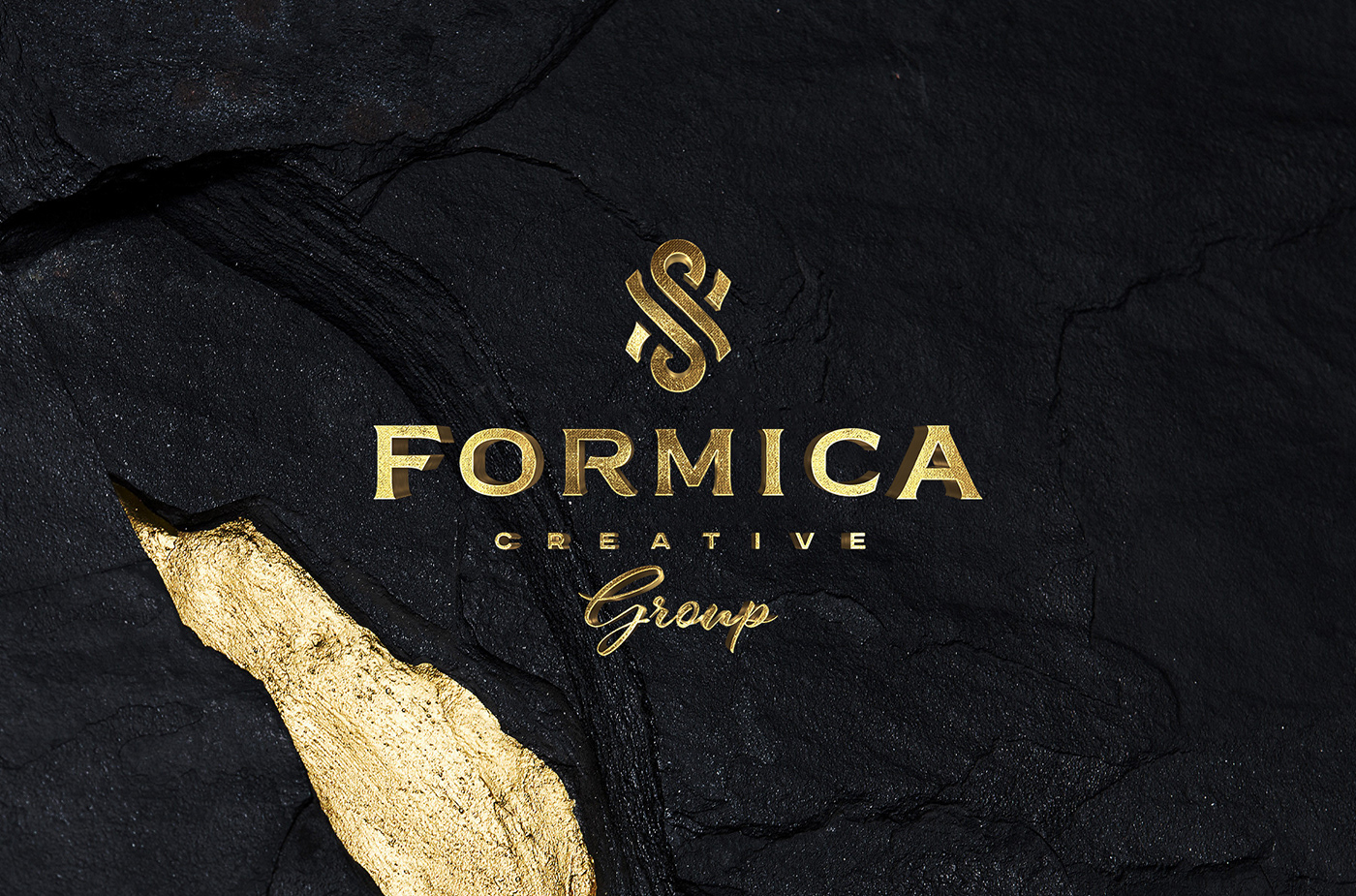
After defining the possible design direction, I create logo sketches for a monogram logo in the form of an ant, which is a direct translation of the word "Formica" from Italian (and this direction becomes the basis for the final version). The monogram is intentionally kept minimalistic, avoiding excessive decorative elements. The goal is to achieve a simple and recognizable symbol based on a single letter. The agency's logo combines a capital Latin letter "F" with the lexical meaning of its name.
Creating a recognizable monogram from a single letter is more challenging than using two or three, but it creates a unique form with elegant intersections. Therefore, the resulting logo will undoubtedly become a charismatic emblem for the event agency. Furthermore, as reputable companies continually refine their logos, the simplicity of the design allows for easy adaptability without losing the essence that it embodies.
